
 In today’s digital age, creating impactful image graphics is more important than ever. Whether you’re a small business owner, a marketer, or just someone looking to improve your visual content, understanding how to craft stunning images can make all the difference. In this blog post, we’ll explore nine essential image editing tips to help you create image graphics that stand out and engage your audience.
1. Know Your Audience
Before you start designing, understand your audience. What are their preferences? Do they like minimalist designs or something more elaborate? Knowing this will guide your design choices, ensuring your graphics resonate with them.
Tailor your content to their needs and interests. For young adults, vibrant colors and trendy designs might work best. For a professional audience, a clean and sophisticated look could be more effective. Always keep your audience in mind.
Gather feedback from your audience. This provides valuable insights into what works and what doesn’t. Use this feedback to refine your graphics and improve future designs. Listening to your audience can lead to more impactful visuals.
2. Keep It Simple
Simplicity is key when it comes to image graphics. Cluttered designs can be overwhelming and confusing. A simple, clean design can be more effective in delivering your message. Focus on the essential elements and avoid unnecessary details.
Ensure your message is clear and concise. Use minimal text and make sure it’s easy to read. The main purpose of your graphic should be immediately apparent. Simplicity helps in making your message stand out.
Don’t underestimate the power of white space. It can make your design look more organized and less cluttered. White space helps in highlighting the key elements of your design, making it more visually appealing.
3. Choose the Right Colors
Colors significantly impact how people perceive graphics. Different colors evoke different emotions. For example, blue evokes trust and calmness, while red creates urgency. Use color psychology to your advantage.
Maintain a consistent color scheme to build brand recognition. Choose a primary palette that reflects your brand identity and stick to it across all graphics. Consistency makes your visuals recognizable.
Ensure enough contrast between text and background to improve readability. High contrast makes the text stand out, while low contrast makes it hard to read. Always test your color combinations for readability.
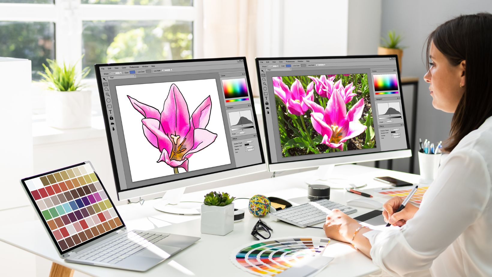
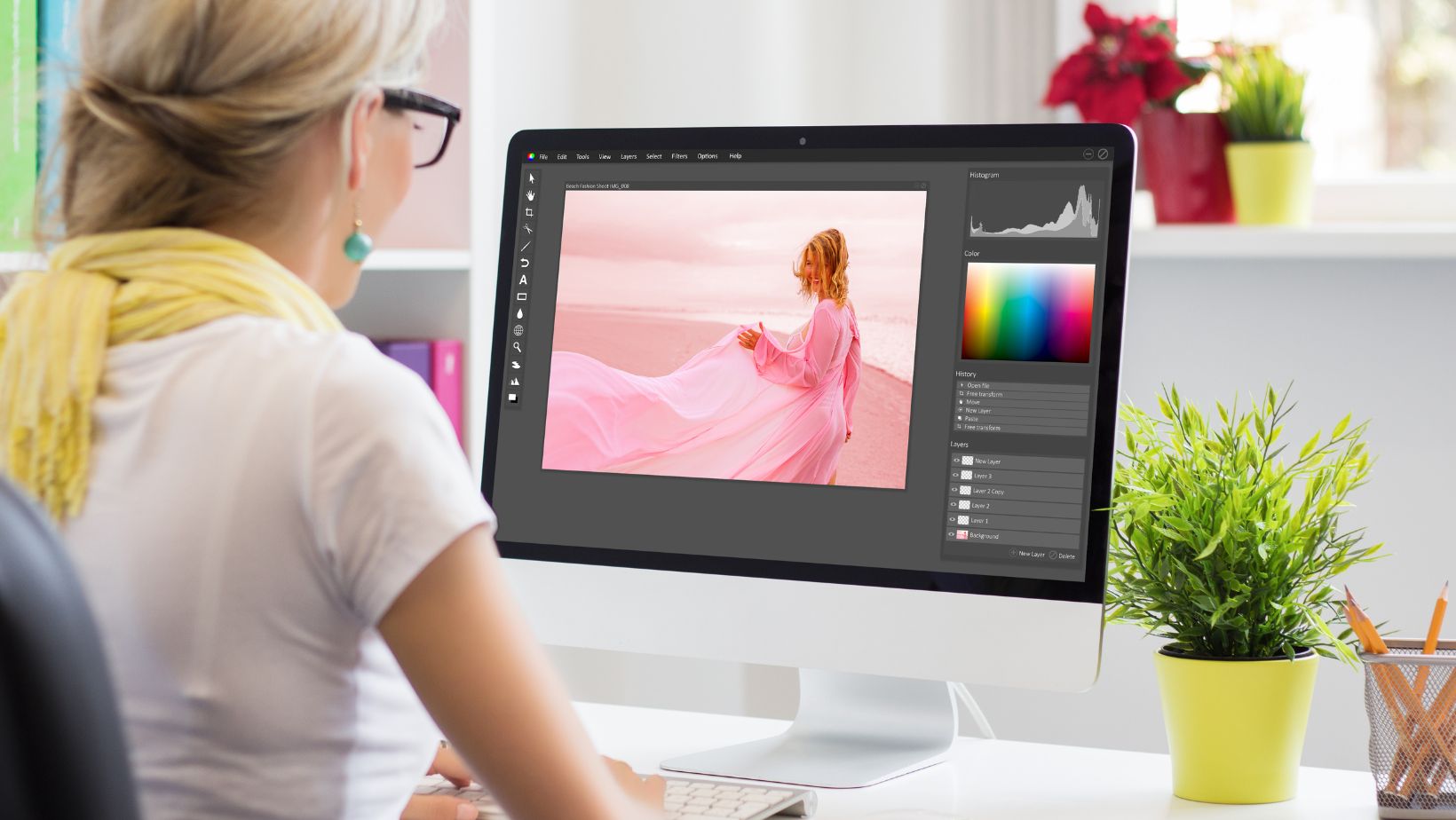
4. Use High-Quality Images
High-quality images can make a huge difference in your graphics. Low-resolution images can look pixelated and unprofessional. Freelance graphic designers always use high-resolution images to ensure your graphics look sharp and polished.
There are many sources where you can find high-quality images. Stock photo websites like Unsplash and Pexels offer a wide range of free images. Alternatively, you can invest in premium stock photos for more unique and high-quality options.
Don’t be afraid to edit and enhance your images. Use tools like Adobe Photoshop or Canva to adjust brightness, contrast, and colors. Enhancing your images can make them more vibrant and appealing.
5. Focus on Typography
Typography plays a crucial role in your design. Choose fonts that are easy to read and complement your overall design. Avoid using too many different fonts; stick to one or two to maintain consistency.
Use typography to create a visual hierarchy. Different font sizes and weights can help in highlighting the most important elements of your message. This makes your graphic more organized and easier to read.
Pay attention to alignment and spacing. Proper alignment makes your design look more professional, while adequate spacing ensures your text is easy to read. Avoid cramming text together, as it can make your graphic look cluttered.
6. Utilize Icons and Illustrations
Icons and illustrations can add visual interest to your graphics. They can break up text and make your design more engaging. Use them to highlight key points or to add a decorative touch to your graphics.
Ensure the style of your icons and illustrations matches the overall design. Consistency in style helps in creating a cohesive look. Avoid mixing different styles, as it can make your design look disjointed.
Icons can also enhance understanding. They can represent complex ideas in a simple and visual way. Use icons to support your message and make it more accessible to your audience.
7. Incorporate Branding Elements
Incorporate your branding elements into your graphics. This includes your logo, brand colors, and fonts. Place your logo in a prominent yet unobtrusive position to ensure brand visibility without overpowering your design.
Maintaining a consistent visual identity across all your graphics helps in building brand recognition. Your audience should be able to identify your brand at a glance. Consistency in branding elements is key to achieving this.
Consider creating custom graphics that reflect your brand identity. Custom illustrations and icons can make your graphics stand out and add a unique touch that sets your brand apart from the competition.
8. Optimize for Different Platforms
Different platforms have different requirements and best practices for image graphics. Ensure your graphics are optimized for the platforms where they will be used. This includes considering dimensions, file sizes, and formats.
With the increasing use of mobile devices, it’s crucial to ensure your graphics are mobile-friendly. This means they should be easily viewable on smaller screens. Test your graphics on different devices to ensure they look good everywhere.
While optimizing for different platforms, maintain consistency across all of them. This ensures a cohesive brand presence. Slight adjustments might be needed, but the overall look and feel should remain consistent.
9. Test and Refine
Testing your graphics and gathering feedback is essential. Share your designs with a small group of people and ask for their opinions. This can provide valuable insights and help you identify areas for improvement.
Consider conducting A/B tests to see which designs perform better. This involves creating two versions of a graphic and comparing their performance. A/B testing can help you understand what works best for your audience.
Design is an ongoing process. Always look for ways to refine and improve your graphics. Stay updated with design trends and continuously seek feedback. Continuous improvement will help you create more impactful visuals over time.
Start Creating Impactful Image Graphics Today
Creating impactful image graphics is an art that combines creativity with strategy. By following these nine essential tips, you can craft stunning visuals that not only capture attention but also convey your message effectively. Remember, simplicity, consistency, and understanding your audience are key. Start applying these tips today and watch your visuals transform.
If you found this article insightful, be sure to explore other topics on our blog for more engaging content. Happy reading!