
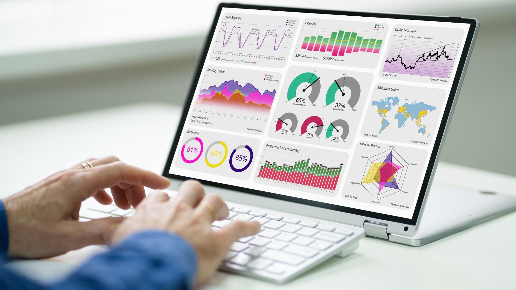
 Given today’s data-driven business landscape, information is power. Data visualization is the art of transforming complex data sets into easily understandable and actionable insights.
While most people are familiar with common chart types like bar charts and line graphs, there are numerous other powerful visualization tools available. In this article, we’ll explore the ten best charts and graphs that can enhance and optimize your business in 2024.
1. Scatter Plots:
Scatter plots are versatile visualization tools that help you explore the relationship between two variables. They consist of individual data points plotted on a graph, with one variable on the x-axis and another on the y-axis. Scatter plots are particularly useful for identifying correlations, trends, clusters, or outliers within your data.
For example, if you want to understand the relationship between advertising spending and website traffic, a scatter plot can help visualize whether increased ad spending leads to more website visitors. This type of chart aids in data-driven decision-making and optimizing your marketing strategy.
2. Flowcharts:
Flowcharts are versatile tools that play a crucial role in visualizing processes and data flow within your organization. They use standardized symbols and shapes to represent different steps, decisions, and actions within a process. Dynamic flowchart design tools are invaluable for optimizing processes, identifying bottlenecks, and ensuring efficient workflows.
Consider you’re mapping out the order processing workflow in an e-commerce business. A flowchart can represent each step in the order fulfillment process, from order placement to shipment. By visualizing the entire process, you can identify areas for optimization, streamline operations, and enhance customer satisfaction.
3. Heatmaps:
Heatmaps are excellent for presenting data in a matrix format, where each cell represents a value. These charts use color gradients to indicate the magnitude of the values, making it easy to identify patterns and outliers. Heatmaps are particularly valuable when dealing with large datasets or matrices.
Imagine you’re analyzing user engagement on a website across different days and hours. A heatmap can provide a visual representation of this data, with color intensity showing peak engagement times. This insight can help you optimize content scheduling for maximum impact.
4. Pie Charts:
Pie charts are effective for illustrating the composition of a whole, showcasing the distribution of different categories as slices of a pie. While not as data-rich as some other charts, they are excellent for conveying the relative proportions of discrete data points.

Pie charts are often used to display market share, budget allocation, or survey results.
For instance, if you want to represent the division of a company’s marketing budget across various channels, a pie chart can provide a clear visual overview of the percentage allocated to each channel. This helps in optimizing marketing resource allocation.
5. Area Charts:
Area charts are similar to line charts but add depth to the visualization by shading the area beneath the lines. They are effective for displaying cumulative data or showing the distribution of values over time. Area charts are often used to represent data such as stock market indices, population growth, or website traffic trends.
Suppose you’re tracking the growth of your email subscriber list over several months. An area chart can display the cumulative growth, making it easy to visualize the overall trend and identify periods of accelerated growth.
6. Bubble Charts:
Bubble charts are an extension of scatter plots, with the added dimension of bubble size to represent a third variable. They are ideal for visualizing multidimensional data and comparing data points across three dimensions. The x and y-axes still represent two variables, while the size of each bubble signifies the magnitude of a third variable.
Consider you’re analyzing a dataset that includes information about cities’ population, GDP, and air quality index. A bubble chart can represent each city as a bubble, its position determined by GDP and air quality, and the size of the bubble indicating population size. This chart helps in optimizing city selection for business expansion.
7. Donut Charts:
Donut charts are a variation of pie charts with a hole in the center. They are visually appealing and less cluttered than traditional pie charts. Donut charts are particularly useful when you want to emphasize one or two categories within a dataset.
For example, if you’re showcasing the revenue distribution of different product categories within your business, a donut chart can emphasize the most significant product categories by allocating a larger portion of the chart to those categories. This aids in optimizing product development and marketing efforts.
8. Spider Charts (Radar Charts):
Spider charts, also known as radar charts, are valuable for comparing multiple variables across different categories or entities. They consist of a series of axes radiating from a central point, with each axis representing a different variable. The data for each entity is plotted as points along these axes, creating a visual polygon that helps compare data points across various categories.
Imagine you want to evaluate the performance of different employees based on attributes like sales, customer satisfaction, and project completion. A spider chart can represent each employee as a polygon, allowing you to quickly compare their performance across these attributes. This aids in optimizing workforce management and performance reviews.
9. Waterfall Charts:
Waterfall charts are excellent for visualizing incremental changes in data resulting from a series of positive and negative values. They provide a clear picture of the cumulative impact of each data point on the final result. Waterfall charts are commonly used in financial analysis to illustrate how an initial value is affected by a sequence of gains and losses.
Suppose you’re analyzing a company’s monthly financial statements, including revenue, expenses, and investments. A waterfall chart can show how each factor contributes to changes in the company’s financial position. This helps in optimizing financial strategies and budget planning.
10. Treemaps:
Treemaps are hierarchical visualizations that display data in a nested structure, with larger rectangles representing categories or groups and smaller rectangles within them representing subcategories or items. Treemaps are effective for showcasing hierarchical data relationships and comparing the distribution of values within categories.
Imagine you’re managing a product inventory with different categories and subcategories. A treemap can provide a hierarchical view of how products are organized, with larger rectangles representing categories like electronics and smaller rectangles representing subcategories like smartphones and laptops. This helps in optimizing inventory management and understanding sales patterns.
Leveraging the Power of Data Visualization
Effective data visualization is a key to unlocking insights from your data and making informed business decisions. While bar charts and line graphs are common choices, there are numerous other charts and graphs, including flowcharts, that can provide deeper insights and optimize your business processes.
By incorporating these visualization techniques into your data analysis toolkit, you’ll be better equipped to explore complex data relationships, identify trends, and communicate your findings effectively in 2024. Data visualization is not just about making data look appealing; it’s about transforming data into actionable insights that drive informed business decisions and enhance efficiency.