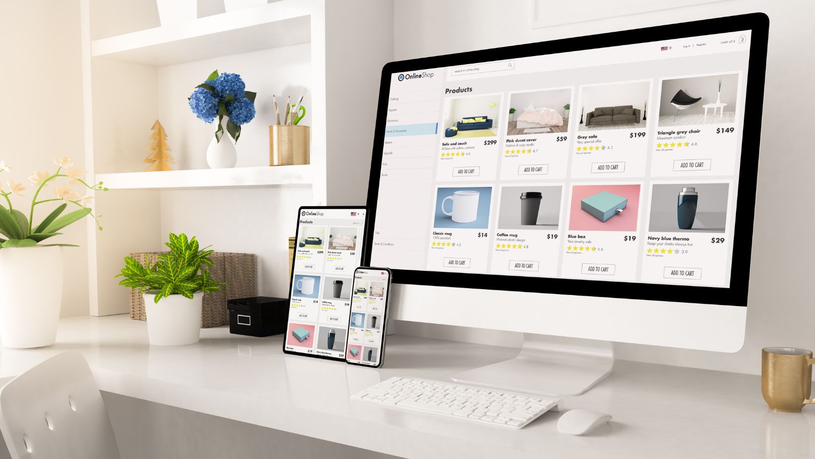
A seamless user journey on your business website will ensure an improved user experience and, for this matter, increased conversions. A well-designed website, in which every step flows into the next one with ease, increases engagement, reduces bounces, and hence brings more sales. Here is how you can ensure your website provides a seamless and intuitive journey for every visitor.
Know Your Target Audience
It all begins with understanding your audience inside and out. When you understand their needs and where their pain points lie, you can create a website that speaks to them. Employ Google Analytics, user testing, and surveys to understand the predispositions of your audience: what they like and how they use your website.
It helps you to align the habits and expectations that your audience possesses with the layout, content, and navigation of the website. If the audience is busy professionals for instance, then your website design has to be speedy and simple.
Easy Navigation
Navigation is one of the most critical elements within the user journey. It should be intuitive; hence, it should be easy to find and work with. If people have to search for the major areas of your website, they may leave before ever seeing what you have to offer. Ensure that a menu on your website is duly organized, where clear categorization has been made that makes sense to your users.
This may also mean for businesses the inclusion of sections such as Products, Services, About Us, Blog, and Contact Us. Ensure that your menu is consistent across pages and that important pages are one click away. You might want to consider an inclusion of a search bar also for users who would rather seek out what they want themselves.
Simplify the Check-out Process
Since this website is eCommerce-based, a smooth checkout process increases the rate of converting visitors into customers. You would never want to frustrate your customers with a complicated and time-consuming process for checkout that can only lead to abandoned carts and lost sales. Improve the user journey by giving easy and smooth checkout with fewer steps.
Allow guest checkouts for customers that would not want to create an account; that is just nice, giving them that option. Include a progress indicator so users know where they are in the process. Make sure your payment gateway is user-friendly and supports various modes of payment, such as but not limited to credit cards, PayPal, and digital wallets like Apple Pay or Google Pay.
Optimize Page Load Speed
Speed is a vital aspect of websites that will ensure a seamless experience for users. In fact, if it takes more than a few seconds to load your pages, most users would be annoyed and leave instantly, and hence your bounce rate would be affected. “Google says 53% of mobile users will abandon a page that takes longer than 3 seconds to load.” Therefore, optimization of the load time of your website would be one factor that could improve user engagement. Ask a professional from a web design agency to assist you with the website optimization.
Other ways to get the most out of page speed include compressing images, avoiding heavy scripts, and using state-of-the-art web technologies that offer lazy loading-in which the image loads at the very last minute. You can also use a content delivery network or CDN to help your users access your content more quickly-especially when they are from other parts of the globe.
Create Compelling and Easy-to-Read Content
Content is king, and it will help walk your users through your site. This needs not only to be relevant to the target audience but easy to understand. Break up big chunks of paragraphs into headers, bullet points, and visual elements for a much more reader-friendly output.
Any calls to action should be strong and direct, easing the user deeper into their journey. That may be to encourage them to read more, to sign up for a newsletter, or to make a purchase-whichever it might be, your CTA should pop and be at a key position on the page.
You can put a very visible call to action above the fold on the homepage, for instance, to inquire into products or services. As the users scroll down, include other calls to action that can help users take further steps, such as probably scheduling a consultation or adding items to a cart.
Make Your Website Friendly for Mobile Users
In the digital frontier of today, one thing that’s not up for compromise is having your website mobile responsive. Considering the fact that more than half of all web traffic comes through mobile, this means quite a few people won’t have to see your website on their desktop. A responsive design will automatically adjust the size of your website to the device it’s opened on; therefore, someone who looks up your website can have an excellent time on desktops, tablets, or even smartphones.
Make sure images, buttons and forms function optimally out of the mobile device, and ensure that touch actions such as clicking buttons and scrolling are intuitive and easy to complete.
Use Data to Continuously Improve the User Journey
Observe the users’ behavior continuously once the website goes live to realize where improvements might be needed. Analytically apply this to monitor the flow of visitor traffic around your site, watching what stops and distracts them; these metrics inform smart decisions regarding which website areas need tweaks or enhancements.
A/B testing is going to be a powerful means of testing changes to your website and observing how they affect user behavior. As an example, you may want to try different versions of a CTA button or play with page layouts to see which gives better engagement and higher conversion rates.
Conclusion
A seamless user journey lays the foundation for an experience that will have visitors staying on longer and driving conversions onto your business website. By understanding your target audience, prioritizing intuitive navigation, optimizing the checkout process, and continually testing and refining your site, you will be able to create a website that will meet and even exceed user expectations. The point is, every decision that relates to the design and functionality of your website should answer the question of how to make the navigation for visitors around the website easier and their taking action more enjoyable.


