
Understanding Color Theories
The Basics of Color
Delving into the basics, color is more than just a visual component. It’s an emotional language that artists use to tell their stories. The psychology of color, for instance, plays a crucial role in how a piece of art can engage its audience on a deeper level. Every hue has its unique psychological properties that can significantly influence a person’s mood. Red, for example, is often associated with energy and passion. Blue, on the other hand, evokes a sense of calm and tranquility.
The Color Wheel
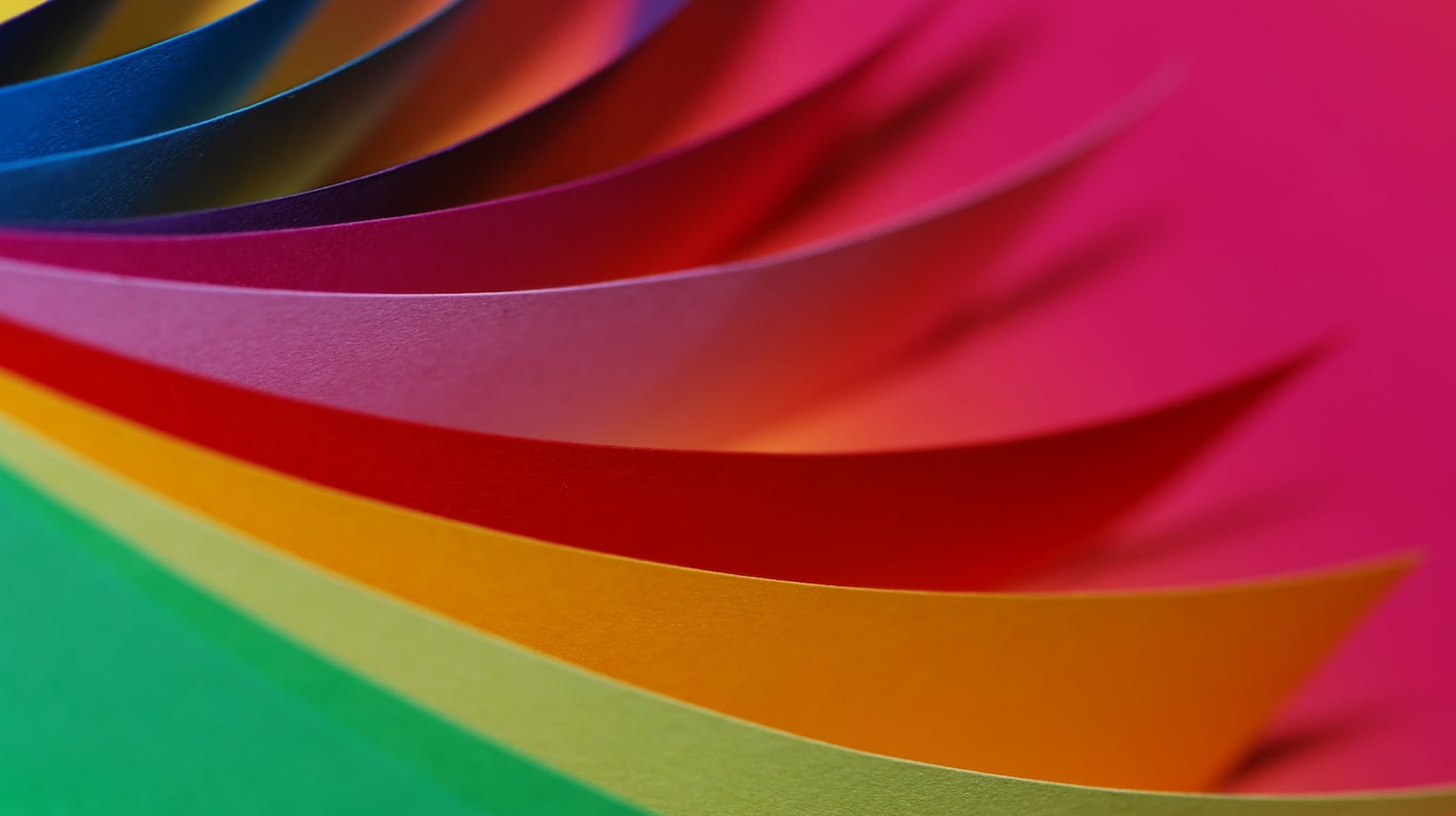
An artist’s best friend, the color wheel, serves as a fundamental tool in understanding color relationships. It’s essentially a circular diagram that maps out how colors blend, complement, or contrast with one another. Sir Isaac Newton invented the first color wheel in 1666, and it has been a valuable resource for visual artists ever since.
By truly understanding the color wheel, artists can strategically employ color harmonies within their pieces. Complementary colors energize a composition, while analogous colors create a more soothing effect. This deliberate use serves to guide the viewer’s eyes throughout the artwork and evoke specific emotional responses.
Primary, Secondary, and Tertiary Colors
Primary colors – red, yellow, and blue – serve as the building blocks of all other colors. Mixing these primary colors in varying degrees yield secondary colors: green, purple, and orange. Tertiary colors – a combination of a primary and a secondary color – such as red-orange or blue-green, further expand the color palette.
By masterfully manipulating these colors, artists can create a rich tapestry within their work. They can add depth, express emotion, and even create illusions of light and space. Therefore, an understanding of primary, secondary, and tertiary colors paves the way for artists to exert complete control over their artwork’s narrative and emotional impact.
How do Most Artists use Color Theories to Their Advantage?
Delving even further into the art world’s colorful secrets, we can start to explore how artists optimize their understanding of color theories. They’ve got a range of clever techniques under their sleeves, from ensuring color harmony to wielding color’s powers on human emotions and psychology.
Color Harmony and Balance
Ever noticed how some artworks just seem to feel ‘right’? That’s the magic of Color Harmony and Balance at work. Artists carefully pick and choose colors that serve the general aesthetics of their pieces. They may use colors that work well together or offset one dominant color with a series of complementary hues to create a sense of unity and balance.
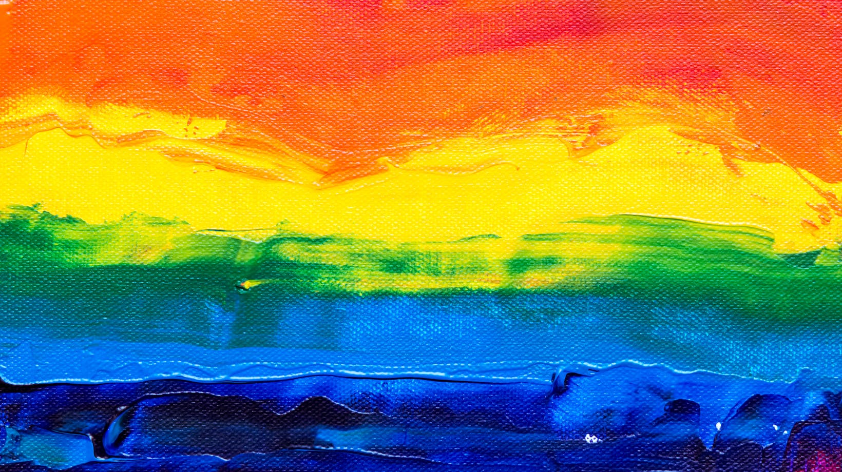
They often make use of the color wheel, where colors sit opposite one another. These are called complementary colors and they generate a powerful visual contrast when used together. For example, red and green or blue and orange. Artists may also use analogous colors – hues that are next to each other on the color wheel – to serve a more peaceful, less contrasted visual experience.
The Psychology of Color
Artists are well aware that different colors evoke different psychological reactions. This subtle interplay of arts and psychology is known as color psychology, and artists often use this to their advantage when they want to instill specific feelings or responses from their audience.
Red, for instance, is associated with intensity and passion, while blue indicates calmness and tranquility. These color-meaning associations are not always universal, as they can vary greatly depending on cultural context, but artists can utilize this generalized color psychology to enhance their work’s emotional impact.
Creating Depth and Dimension
And then there’s the art of creating depth and dimension. Artists can manipulate color in such a way that makes a two-dimensional piece appear three-dimensional, thereby adding to its realism or giving it a unique visual twist.
Shading and toning play crucial roles here. Using increasingly darker tones of a color can create an illusion of depth and suggests that an area of artwork is shadowed or further away. Similarly, making sections of art lighter or using warmer colors can indicate that they’re closer to the viewer. These applications of color theory are invaluable for artists wanting to create dynamic, visually engaging works of art.
The art world’s relationship with color is a complex, nuanced one. Yet, understanding this bond — how colors work, the emotional responses they spark, and the techniques artists use to manipulate them — is a fascinating journey, opening up new depth for art lovers and creators alike.