
In a world inundated with data, understanding how to transform numbers into compelling visual presentations is crucial. One of the most intuitive data visualization tools is the pie chart, a classic format that allows viewers to grasp complex data easily. In this article, you will gain deeper insight into pie charts, their purpose, and application, as well as uncover some hidden benefits of using them.
Understanding the Pie Chart and Its Purpose
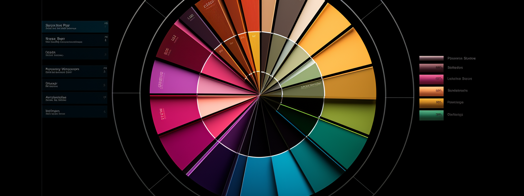
The pie chart is a circular chart that presents numerical proportions by dividing a circle (or pie) into proportional slices. Each slice of the pie represents a category of data.
The primary purpose of a pie chart is to show the relationship of parts to a whole. With its visually inclusive and easy-to-understand layout, it provides an immediate sense of the proportional distribution of the collected data.
When reading a pie chart, an individual can quickly comprehend complex data without getting lost in the numbers. By offering this clarity, pie charts aid businesses and individuals in making informed decisions based on visible data trends.
To better understand the real-world application of these charts, you may want to have a look at some pie chart examples.
Highlighting the Core Principles of Effective Pie Charts
Creating valuable pie charts requires adherence to certain principles. Firstly, the data collected should be suitable for a pie chart format – it should represent parts of a whole, and the categories should be mutually exclusive.
Clarity should be paramount in creation. The chart should be minimally designed with labels and percentages provided to understand what each slice represents without ambiguity.
Color consistency is another crucial aspect that aids in understanding the chart. Different shades can be used to represent different data points or values. Also, the total of all segments of the chart should sum up to a meaningful whole, ideally adding up to 100%.
Unveiling the Versatility and Benefits of Pie Charts
One significant advantage of pie charts is that they provide a quick and clear overview of information. At a glance, one can grasp the key implications of the data without having to sift through the actual numbers.

Pie charts offer versatility as they can be used for various types of data across numerous sectors. They are helpful in business for sales and finance reports, in academia for scientific data representation, in public presentations for demographic statistics, and much more.
The pie chart’s simple format also lends itself well to comparisons of proportions. This means it can be useful in situations where one needs to make decisions based on data. Finally, with pie charts, you not only present data but tell a story with data, making you an effective data communicator.
Utilizing Pie Charts for Comprehensive Data Visualization
Pie graphs are an excellent way to present complex data. They transform a large numbered data set into a simple-to-understand visual format, allowing the data’s story to be perceived at a glance.
To maximize the impact, it’s critical to be mindful of your audience and the message you want to convey. Understanding this will aid in the design process, ensuring the chart effectively communicates the desired message.
Emphasizing key points of data or highlighting certain sectors can increase the chart’s effectiveness. This can be achieved by extracting a slice of the pie or using bright colors for a particular segment.

Altogether, understanding the functionality and benefits of pie graphs is pertinent for anyone looking to communicate data effectively. By utilizing this visualization tool correctly, you can turn endless streams of data into compelling narratives and make informed decisions based on clearly visible trends.