
A staggering 90% of teams still use spreadsheets to track documentation. This fact speaks volumes.
We’ve all experienced it. The team meeting comes to a standstill. Someone desperately scrolls through an enormous spreadsheet to find one crucial data point. The minutes drag on. Everyone’s eyes glaze over. Your quick 30-minute check-in has now turned into an hour-long session.
A better solution exists. Teams that use visual analytics tools create tracking plans 86% faster. They face 90% fewer implementation bugs and reduce their coordination meetings by 80%. Visual analytics transforms complex data into actionable information that everyone can quickly understand.
The move to visual analytics does more than save time – it revolutionizes team decision-making. Meetings become focused and efficient. Teams reach consensus faster. Discussions evolve from understanding data to taking action.
Why Spreadsheets Slow Down Meetings
Spreadsheets were never meant to be collaborative tools for team meetings. Yet they became the default option for most businesses. Studies show that more than 90% of spreadsheets have errors, making them a risky foundation for critical decisions.
Lack Of Up-to-the-Minute Updates
Teams struggle with spreadsheet collaboration. Even modern cloud-based solutions don’t work well when multiple team members need to access files at once. Someone makes a change, and others can’t see it until they refresh their view. This leads to long pauses in meetings while team members try to get on the same page.
Excel’s data synchronization creates the biggest problem. Documents must be saved to cloud locations like OneDrive or SharePoint with AutoSave turned on. Without this setup, others can’t see any changes.
On top of that, linked data between workbooks often fails. Users see error messages like “Unable To Refresh: We couldn’t get updated values from a linked workbook”. Meetings stop as teams fix technical issues. Quick data discussions turn into IT troubleshooting sessions.
Version Control Issues
Version control chaos might be the worst spreadsheet problem in meetings. Send a spreadsheet to five colleagues, and you’ll end up with six different versions with conflicting changes. No one knows which copy is current, who changed what, or how to combine updates without losing work.
This version of mess creates one of Excel’s biggest roadblocks to teamwork. There’s no built-in versioning, change tracking, or conflict resolution. Things get worse when regulations require audit trails and data lineage.
Manual Formatting And Data Errors
Data reliability is affected by issues beyond these collaboration issues. Research shows experienced users make errors in 2–5% of all formula cells. Large spreadsheets almost always have at least one major error.
These aren’t just theoretical problems. Here are some ground examples:
- Cannabis company Canopy Growth had to fix its earnings after a spreadsheet error hid nearly $50 million in losses
- Well-known economists using spreadsheet data to support austerity measures simply “forgot to add up all the lines.”
Data integrity in spreadsheets exists only in theory. Users can type ‘N/A’ where numbers belong, overwrite formulas with static values, or mix currencies with percentages in one column. This flexibility becomes dangerous with multiple editors.
Text formatting in cells often changes without warning. Teams waste valuable meeting time fixing visual problems before presentations instead of discussing content.

Visual analytics tools offer a better way. Platforms like Zebra BI turn complex data into clear, useful dashboards that solve these basic spreadsheet issues. These tools come with built-in features for shared work, version control, and data protection.
What Is Visual Analytics and Why Does It Matter
Visual analytics changes how teams interact with data. This field combines data visualization, interactive interfaces, and analytical reasoning to explore and understand complex datasets. It goes beyond creating colorful charts; raw numbers become interactive visual stories that reveal hidden patterns and relationships.
Definition Of Visual Analytics
Visual analytics aids analytical reasoning through interactive visual interfaces. It’s more than simple graphs or charts; this interdisciplinary approach combines automated analysis techniques with visual representation. Visual analytics serves three main purposes: clear data visualization, compelling data stories, and meaningful insights for stakeholders.
Visual analytics creates a conversation with your data. You can ask questions, get answers, and follow up with new questions, all in a user-friendly visual environment. Data exploration becomes natural instead of scrolling through endless rows and columns.
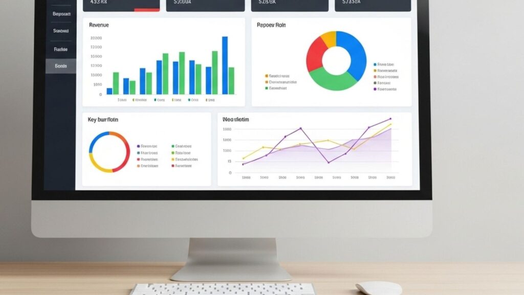
A spreadsheet with thousands of rows overwhelms users. A visual analytics dashboard with interactive graphs and drill-down capabilities makes the same data available and understandable. Raw numbers transform into a visual, interactive context and then into actionable insight.
How Is It Different From Traditional Spreadsheets?
Traditional spreadsheets show data in static, tabular formats that need complete table scans to find values. Visual analytics encodes information visually using color, shape, and size to highlight patterns.
Traditional spreadsheets have these limitations:
- Users must scan every row and column to find the highest sales and the lowest profit
- Comparing values takes mental effort, even with color-coded negative numbers
- Teams need to settle the ranges between different measures manually
Visual analytics tools display the same information through length-encoded sales bars and color-encoded profit indicators. Users see relationships between metrics instantly without manual analysis.
Visual analytics platforms offer true interactivity. These tools let users manipulate visuals, apply filters, and drill into hierarchies to uncover hidden connections, unlike spreadsheets, where charts remain static. Dynamic, immediate dashboards clearly outperform static Excel charts.
Visual analytics systems include advanced analytical capabilities like predictive modeling. Standard spreadsheets can’t match these features.
Benefits of Team Collaboration
Visual analytics changes team dynamics. Visualizations create a shared language to discuss data. Different departments, marketing, finance, and operations, naturally arrange their work when they view the same visual dashboards.
Collaboration-focused teams gain several advantages:
- Teams can work on shared dashboards simultaneously without version control issues
- Users can add important context directly to visualizations through features like note tiles
- Non-technical users explore data without specialized analysis skills
- Teams focus on acting on insights rather than explaining data
Visualizations boost communication efficiency. Team members share screenshots of clear graphs that everyone can understand immediately, rather than emailing large spreadsheets. This leads to faster consensus and productive meetings.
Visual analytics removes barriers to data comprehension. Insights become visible rather than remaining locked in complex spreadsheets. If you’re looking to create a Power BI dashboard, here is a list of Zebra BI examples to inspire and get your project started.
Visual analytics makes abstract concepts concrete. Teams see patterns, spot anomalies, and make faster, confident decisions based on a shared understanding of what the data reveals.
Types of Visual Analytics Tools You Can Use
The right visual analytics tools can reshape how your team processes information. Several solutions in the market can help you say goodbye to spreadsheet headaches.
Dashboard Platforms
Dashboard platforms give you centralized views of business data through accessible visualizations. These tools excel at bringing multiple data sources together into clear, useful displays.
Tableau dominates the market with its visual-first approach to data analysis. The platform’s drag-and-drop interface lets anyone create powerful visualizations, whatever their technical expertise. Users can connect to hundreds of data sources, work with massive datasets, and build custom dashboards.
Microsoft’s Power BI works seamlessly with the Microsoft 365 ecosystem. The platform costs $14 USD per user per month, which is significantly lower than Tableau’s $75 USD per user per month. Power BI excels especially when you have financial analytics needs and stands as Microsoft’s top choice for organizations that need visual data solutions.
Domo sets itself apart through its unique capability to combine live data from over 1,000 sources. The cloud-based architecture helps organizations centralize their data and act quickly. Domo has AI-driven alerts and insights that automatically interpret your data, showcase wins, and identify issues.
Embedded Analytics Tools
Embedded analytics tools work directly within your existing applications and put insights where users work. Users don’t need to switch between different applications anymore.
GoodData specializes in embedded analytics, making it perfect for businesses that want to integrate insights into customer-facing apps. The cloud-native architecture delivers high availability with built-in security and role-based access controls.
Sisense’s Compose SDK gives pixel-perfect UX control. Organizations can run queries and create custom data visualizations right inside their applications. The platform also has an Embed SDK JavaScript library that makes application communication easier for quick integration.
Looker’s robust API coverage opens up possibilities beyond traditional dashboards. Teams can embed interactive dashboards into applications. Users explore existing visualizations, ask new questions, and examine row-level details.
Design-Integrated Tools Like Glazed
Design-integrated tools bring a fresh approach by connecting analytics directly to design elements – a perfect match for product teams.
Glazed turns tracking spreadsheet chaos into visual documentation connected to Figma designs. The platform puts tracking specifications right on the design canvas and links each event to specific UI elements. Teams no longer face the “which button?” confusion from spreadsheets or markdown specs.
Companies using Glazed have eliminated tracking alignment meetings and cut implementation bugs by 50%. The visual approach makes analytics available to everyone because specifications link directly to design components.
Glazed treats events like reusable code components. Teams define them once in a unified repository that iOS, Android, and web teams implement from the same source specification.
Ai-Powered Visual Analytics Software
AI-powered tools go beyond visualization by finding patterns and suggesting insights automatically.
ThoughtSpot delivers search-driven analytics with AI-powered recommendations. The Google-like interface helps business users ask natural-language questions without dashboards or analyst help. A sales VP types questions about pipeline progress and gets visual answers right away.
AI data visualization tools automate data preparation, pattern identification, and visualization creation. These tools apply statistical models to data, recommend visual formats, and predict future trends accurately.
Look for tools that support natural language queries. This feature helps non-technical users get quick answers without complex query knowledge.
Conclusion
Modern teams need quick, accurate insights that spreadsheets simply can’t provide. The numbers tell a compelling story – visual analytics helps create tracking plans 86% faster, reduces bugs by 90%, and cuts down team arrangement meetings by 80%. These figures translate directly into saved hours and fewer headaches.
Picture your last meeting with lots of data. Someone probably spent ages scrolling through endless cells to find one important number while everyone watched and waited. Visual analytics solves this common problem. Teams spot patterns right away instead of trying to make sense of endless rows.
Visual analytics turns data from a problem into a competitive edge. Teams can now forget about drowning in spreadsheets and welcome clearer insights, quicker decisions, and better meetings. Your colleagues will appreciate the difference.